AHOY — A Digital Space to Talk, Call & Connect

Services

App UI/UX Design

Category

Communication

Client

Ahoy

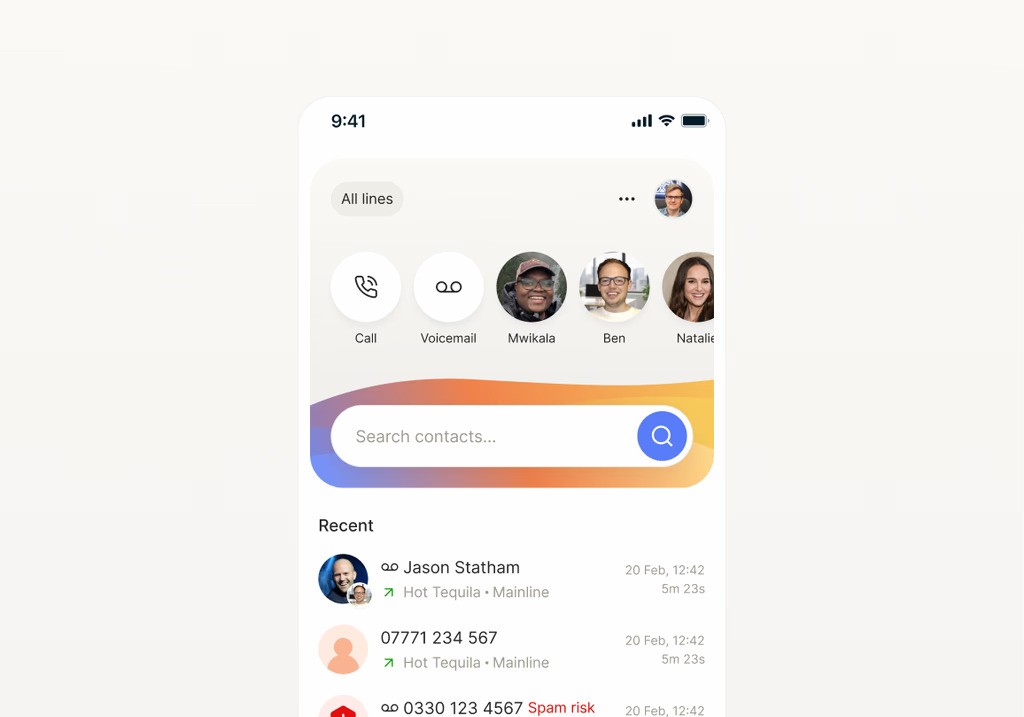
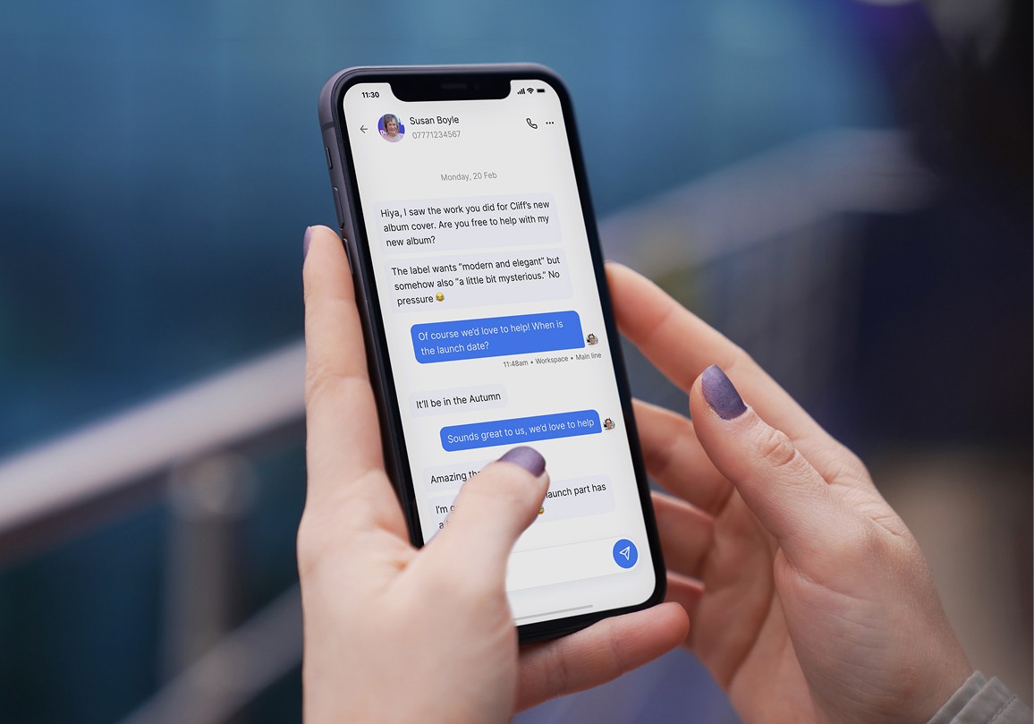
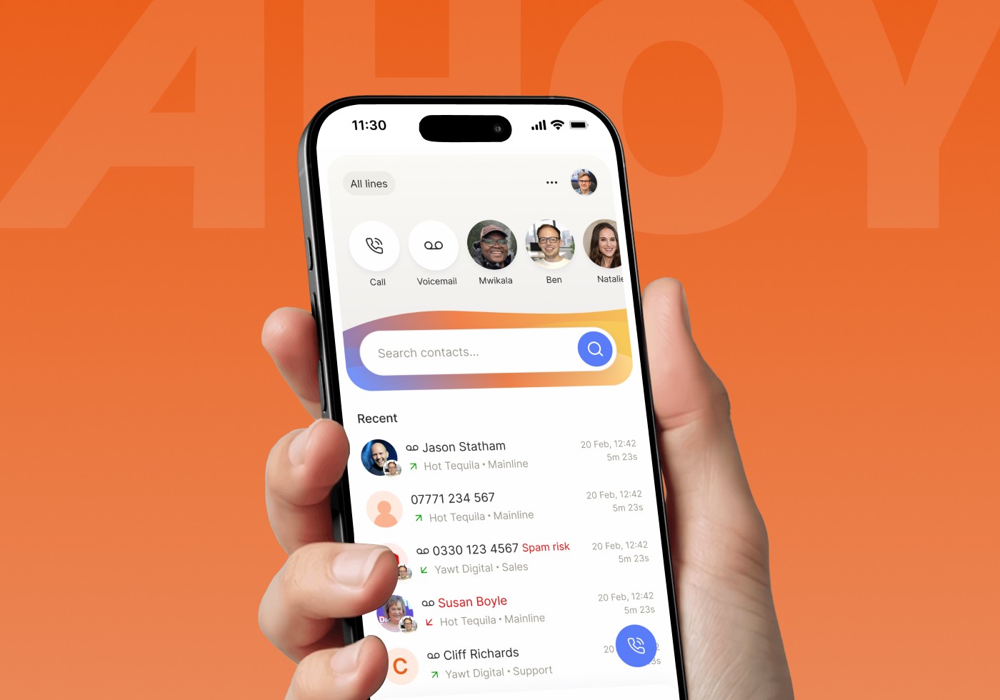
AHOY is a communication app designed to make everyday conversations feel simple, fast, and natural whether users are messaging, calling, or connecting with people who matter to them.

My role was to design the complete mobile app experience, turning its communication features into a clear and intuitive interface where every interaction feels familiar without making the product feel ordinary.
Designing Around the Way People Communicate

Communication apps are used quickly and repeatedly, which means even small usability issues can create friction.

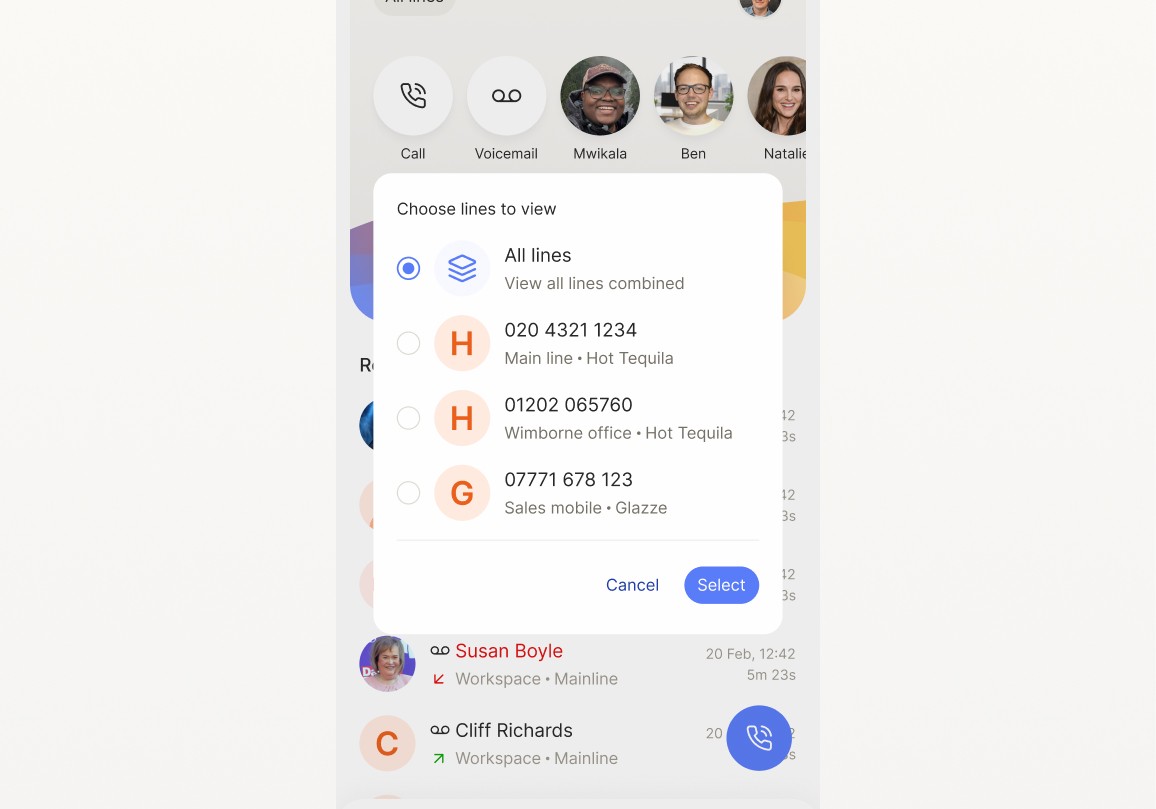
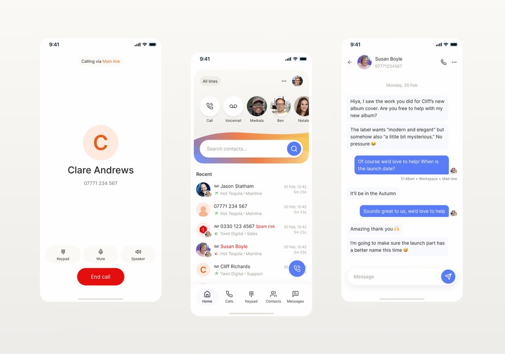
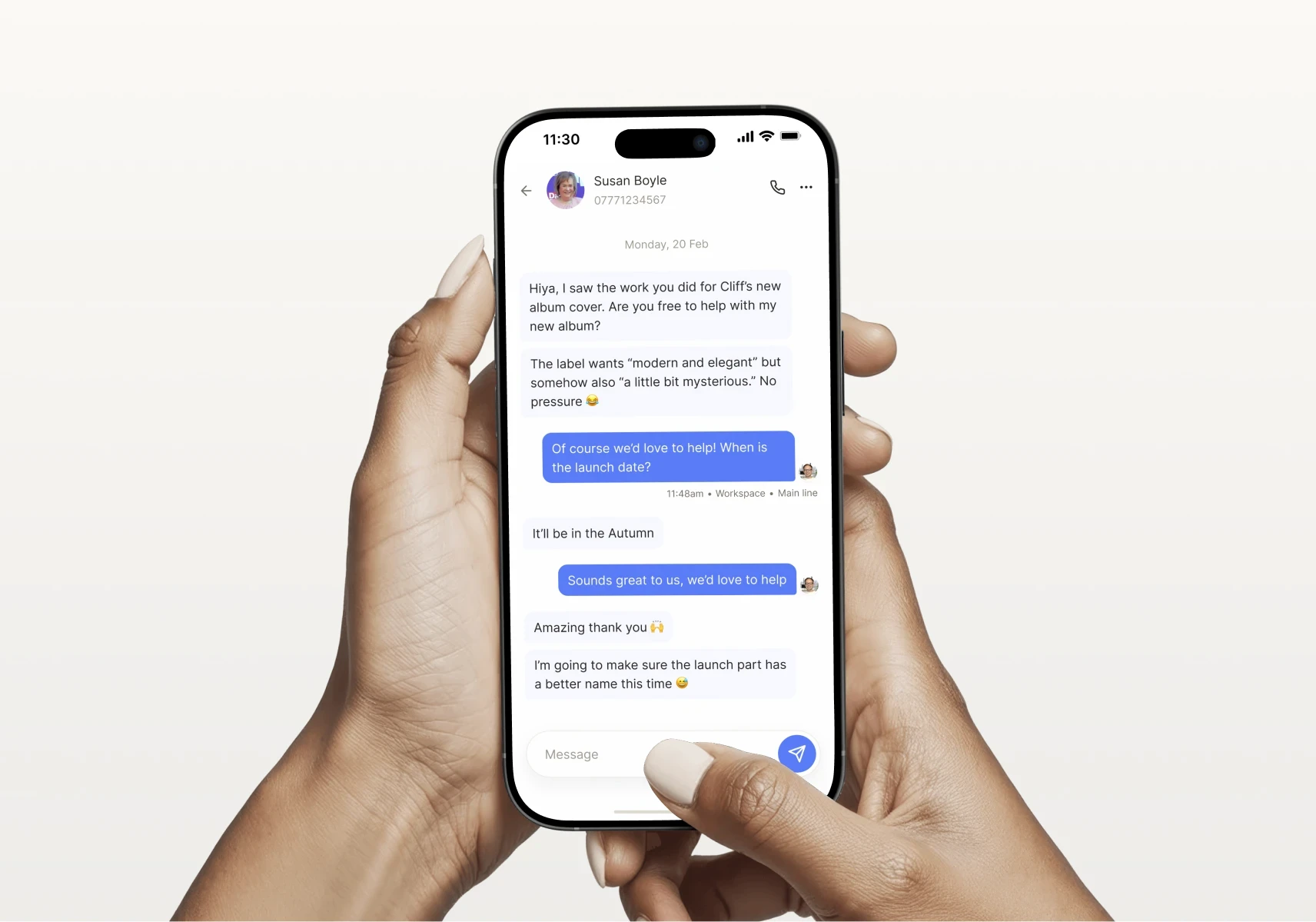
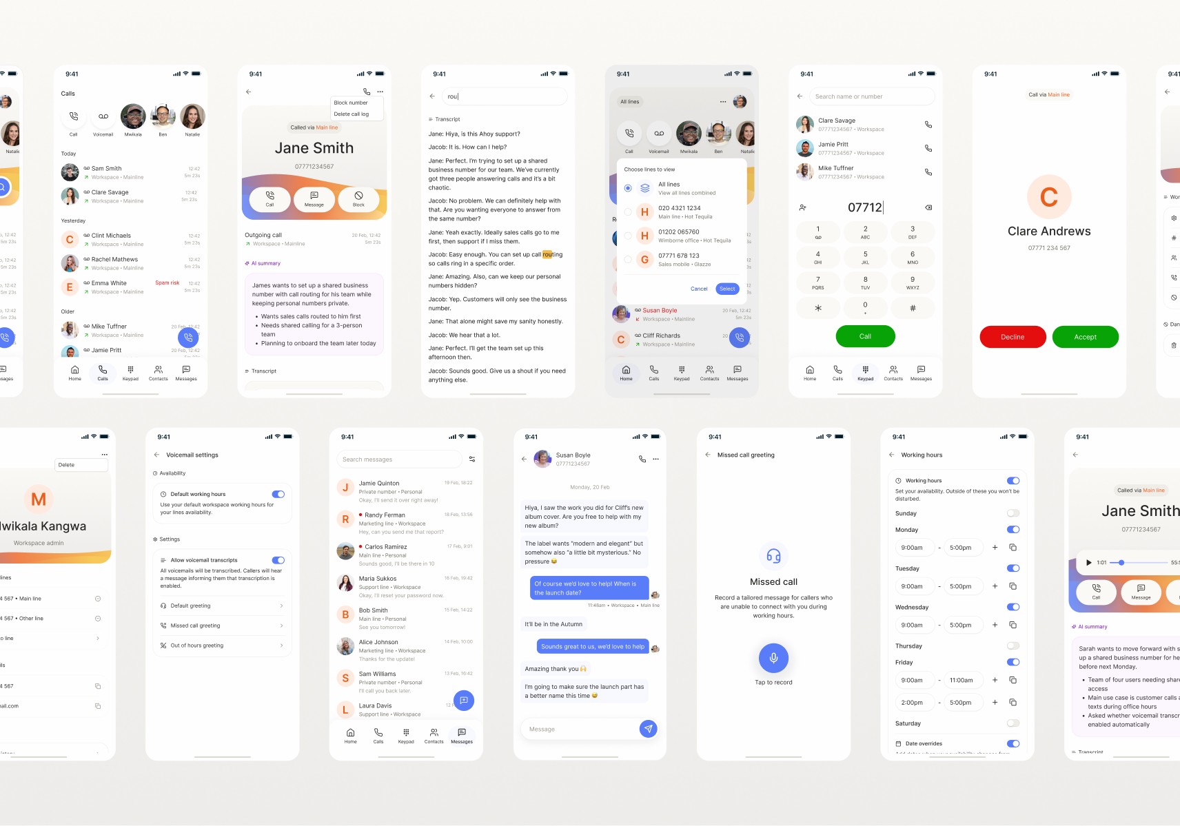
I focused on creating clear user flows around the app’s core actions — starting conversations, navigating chats, making calls, finding contacts, and moving between different areas of the product.

The challenge was to keep these frequent interactions simple while giving users enough information and control exactly where they needed it.
Portfolio project image

Familiar Enough to Use.

The interface needed to feel instantly understandable without becoming another generic messaging experience.

I developed a consistent visual language across the app using clear hierarchy, purposeful spacing, recognizable interaction patterns, and reusable UI elements.

Each screen was designed as part of the larger experience rather than in isolation, helping conversations, calls, contacts, profiles, and other features feel like parts of one connected product.

AHOY is a communication app designed to make everyday conversations feel simple, fast, and natural whether users are messaging, calling, or connecting with people who matter to them.

My role was to design the complete mobile app experience, turning its communication features into a clear and intuitive interface where every interaction feels familiar without making the product feel ordinary.

Designing Around the Way People Communicate

Communication apps are used quickly and repeatedly, which means even small usability issues can create friction.

I focused on creating clear user flows around the app’s core actions — starting conversations, navigating chats, making calls, finding contacts, and moving between different areas of the product.

The challenge was to keep these frequent interactions simple while giving users enough information and control exactly where they needed it.
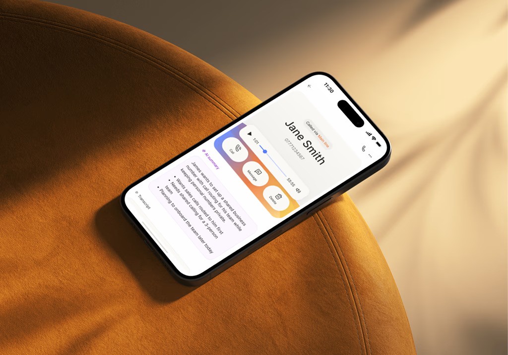
Portfolio project image

Familiar Enough to Use.

The interface needed to feel instantly understandable without becoming another generic messaging experience.

I developed a consistent visual language across the app using clear hierarchy, purposeful spacing, recognizable interaction patterns, and reusable UI elements.

Each screen was designed as part of the larger experience rather than in isolation, helping conversations, calls, contacts, profiles, and other features feel like parts of one connected product.

Available for Work

Back to top

Back to top

Let's create
something
extraordinary
together.

Let’s make an impact

M. Shayan

UI/UX Designer & Web Developer

Got an idea that needs the right creative direction? Let’s design it, build it, and bring it to life.

2026 Shayverse by M. Shayan. All rights reserved.

Available for Work

Back to top

Back to top

Let's create
something
extraordinary
together.

Let’s make an impact

M. Shayan

UI/UX Designer & Web Developer

Got an idea that needs the right creative direction? Let’s design it, build it, and bring it to life.

2026 Shayverse by M. Shayan. All rights reserved.

Available for Work

Back to top

Back to top

Let's create
something
extraordinary
together.

Let’s make an impact

M. Shayan

UI/UX Designer & Web Developer

Got an idea that needs the right creative direction? Let’s design it, build it, and bring it to life.

2026 Shayverse by M. Shayan. All rights reserved.

Get Template

Start Building

for

Free

Create a free website with Framer, the website builder loved by startups, designers and agencies.